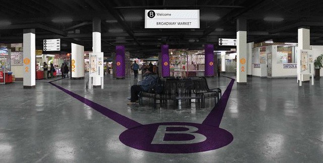
Design students from the Rochester Institute of Technology presented their recent work, a new singular vision for the Broadway Market, this afternoon.
Working with Professor Alex Bitterman, 11 graphic and industrial design students captured the imagination of those attending with a set of refreshing interior and exterior proposals. Council President and Broadway Market neighbor David Franzcyk and Broadway Market Director Tom Kerr attended this afternoon's event.
Here's the new look by day and night.
The implementation of this new vision for an East Side landmark could be phased in over a number of years. Kudos to Professor Bitterman and his students for showing the way.
The full text and pics of the RIT/Broadway Market design initiative is available here (.pdf).
update - 9:40pm - check out Alex Bitterman's site! Brian Meyer covered the story for the Buffalo News - here.
__________________________________________________________________________
building index • fixBuffalo flickr • creative class • shrinking cities • americansuburbX
spacing toronto • infrastructurist • inhabitat
building index • fixBuffalo flickr • creative class • shrinking cities • americansuburbX
spacing toronto • infrastructurist • inhabitat


9 comments:
I love the design suggestions for Broadway Market, especially the bold colors and the removal of visual clutter. The interior reminds me of Amsterdam's Schiphol Airport. Will any of these suggestions be implemented? I hope so.
I'm so proud to see my alma mater present such bold and thorough solutions to a landmark that is in need of serious TLC. They are taking a clean, simple approach that I think could sustain the market through the changing times. It's amazing how much work they did in just 10 weeks!
Glad they did the projects; think the graphics look straight out of the NYC Subway system. Asking all the vendors to conform to one style is silly; linking overall outdoor graphics to neighborhood and regional signage system is smart idea.
Diversity in the Market and neighborhood does not seem to be matched by the design team.
Is there any funding for this project?
Why is the "proprietary content" copywritten by the teacher and students?
http://www.flickr.com/photos/triborough/sets/72057594115175549/?page=14
Ok, I'll be snarky. It took a whole college class to come up with a B in a circle? I mean, honestly, I really like it, it's modern and hip (which means it will never fly in Buffalo) but it's like "Target-meets-NYC-Subway."
Has anyone actually read the 150 page report that these kids churned out? Ugh... the opening letter by the professor was enough to remind me why I have this love-hate relationship with academia.
Note to Dr. Bitterman: if the students' service learning studio is indeed meant to engage and serve the broader community, as you claim, then perhaps it's best if you don't use words like "pedagogical" and "body politic." Plain, if elegant, English will do just fine, thank you, and won't turn off the non-academics who might read your work.
I just read through the whole document. "Ugh" is right. Painting everything overhead BLACK will be an improvement? Just what we need to make a parking ramp feel like a subway station. The B Train wants its logo back, too. (I used to operate that train, so I know)
The doc itself is sad, with wrong spellings (including "FILMORE" at least 15 times), "it's" for "its", etc.
Their hearts were in the right place especially for a project in such great need.
Post a Comment