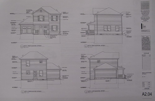
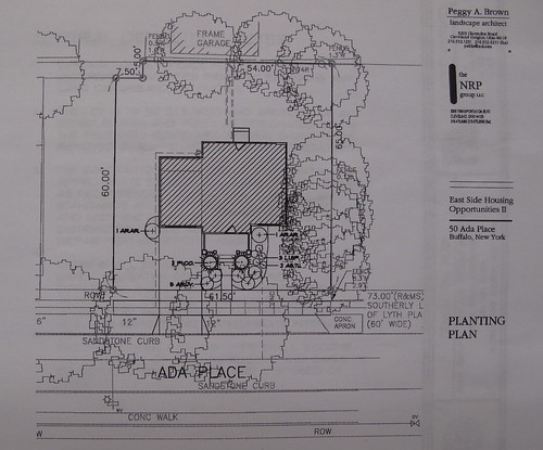
I stopped by City Hall this afternoon and picked up a copy of some of the site sketches for the East Side Housing Opportunities plan that I've been posting about recently. This house is planned for Ada Place as I wrote about yesterday.
This new house will occupy three existing empty lots and have a setback that's completely out of character for Ada Place's compact street scape. After talking with a number of people in the Planning Department at City Hall this afternoon, I learned that there may be some room in the plan to shift the house closer to the street. I hope to have an update about this soon.
Neighborhood Plan background - Part I, Part II, Part III, Part IV, Part V and Part VIThis new house will occupy three existing empty lots and have a setback that's completely out of character for Ada Place's compact street scape. After talking with a number of people in the Planning Department at City Hall this afternoon, I learned that there may be some room in the plan to shift the house closer to the street. I hope to have an update about this soon.
Artspace • BAVPA • Woodlawn Row Houses • fixBuffalo flickr
Creative Class • Shrinking Cities • Saturdays in the neighborhood


6 comments:
The real question is, why didn't city planners at the Hall think matching the form and character of new housing to this street, already? Isn't it their job to apply Urban Design 101 in development scenarios like this? Or have they already given up so quickly on streetscapes like this, whose tight-knit form has such incredible degrees of interest, charm, and - chiefly - economic value?
I wonder what the city's planners are doing with their wages that the City depends so strongly on average citizens to point out obvious opportunities to them.
These residential plans are an embarrassment on every level, a clear indication of Buffalo's brain drain. Thank you, FixBuffalo, for revealing them. I hope the City and Belmont Shelter see the light - and hopefully very soon!
Dear City Hall,
Lose the stupid vinyl shutters and trim the windows with meaningful moldings instead. Shutters are Colonial and Colonial revival, not Victorian. We are a Victorian city. My street has houses of similar vintage, many with restored facades. Not a shutter among them.
Thank you,
Homeowner
Note to Belmont: this is not good enough anymore.
David: keep it up, and let us know if we can help! The comment thread on the previous post is encouraging. :)
It would not surprise me to find out that the people pushing these types of plans actually believe that densely built environments are the cause of crime and poverty. "Murder rates rise proportional to how close a building is built to the sidewalk." For that matter the existence of sidewalks is a clear cause of much crime.
Once everything is converted to vinyl we will be free of crime
Susan is right on with her comments. This is a wonderful street that with some forethought & planning would be an opportunity for small energy efficient housing. The thought of super imposing the planned structure is an act of architectureal heresey. For the past several years a number of folks have discussed and envisioned compatibly designed housing for this unique and treasure street. Lets work together, find aplanthat works & bring an end to the "BS". FKH
Now a real plan for this street would be to insert alleys through the back of these properties with driveways at the rear. This will satisfy our modern demand for car oriented living without shredding the urban fabric, thus adding value. Then renovate these houses (all of them). Then with the empty land you can do one of three things. Land bank it by crating a community garden, Make a park or build new houses to match the scale and urban characteristics of these houses.
A simple plan like described above would a real, meaningful, and lasting impact on this neighborhood.
The thought of this street being replaced with plastic-ville makes me sick to my stomach.
Post a Comment